
.png)
Project Overview
We are changing the look and feel of these components (Trending, related-content & the manually curated-content) based on the Google recommended design suggestions. In addition, maintaining the same backend logic for the “Related" news content.
Background of the study:
- Related Content helps turn search and social traffic into repeat visitors. When users find our site through search, social, or from another article - they're looking for specific information. Once they've found it, Related Content gives them a reason to stay and even better: a reason to come back.
- Trending articles contain a significant amount of user engagement and hold important conversations among our users. With the correct placement/design – users will be able to quickly identify hot topics and engage in the conversation should they wish to.
Problem Statement
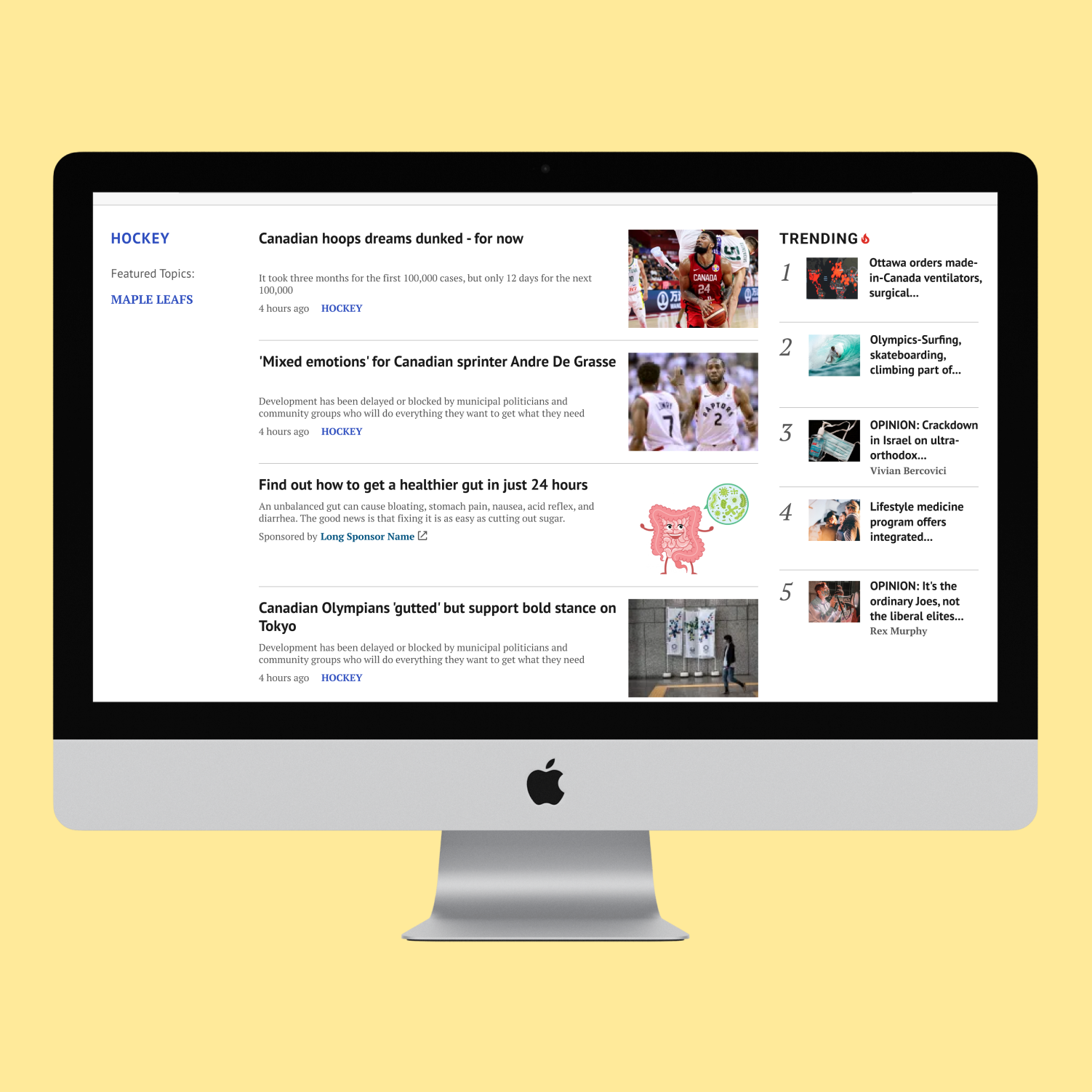
The trending article’s widget, which displays the top 5 most clicked articles in the last 30 mins is driving a lot of traffic but the position is not ideal. On desktop, it’s not in a prominent placement and on mobile screens the user has to scroll all the way to the bottom to see it. It was recommended by Google to have the trending widget sticky, to increase engagement. After investigating the solution, the stickiness of this widget was found that it would cause many issues with Ads and other widgets.
"Before" image shown below
.png)
.png)
Solution
- Mix content options: We offer recommendations based on what they're reading (similar articles) and what's trending based on user clicks and breaking news.
- Crystal Clear Labeling: Trending icon and label so users can easily identify what interests them.
- Personalized Content Journey: Registered users shape their experience by clicking on articles. Consuming "metered content" faster (limited free articles) could incentivize them to subscribe for unlimited access.
- Promoting Relevant Content: We prioritize content that aligns with user interests. We can achieve this by strategically placing relevant articles and highlighting them in prominent positions. This approach increases content recirculation and ensures users discover articles they'll enjoy.
Red border is only for highlight it's not included in the final design
.png)
.png)
Discover Phase
Competitive Analysis
.png)
.png)
Red Routing Analysis
The flow chart provided us with a clear visualization of the components that were critical, major, minor, or trivial to the success of the project. This allowed us to prioritize our focus and allocate resources accordingly to ensure the project's success.
.png)
.png)
Define Phase
Quantitative Research
Methodology:
- Unmoderated test through usability hub:
- Testing the inline widget within the article: a/b test - 15 participants
- Testing related article widget at the bottom of the article: a/b test -15 participants
- These two a/b tests will specifically look at two designs and discovering which option is preferable based on their trustworthiness, or how well they communicate our specific message/idea.
- Recruitment was done through Mailchimp (feedback panel) to capture Broadsheets and Tabloid users.
- Moderated usability testing sessions were conducted via Lookback.io.
- Each session was comprised of a short interview portion to gather insights regarding the user in question (e.g. general usage patterns, etc.), as well as a usability test focused on getting participant reactions and feedback to related content and trending widgets
- A rainbow sheet was the primary tool used for data analysis
Research Questions
- Which design best promotes new content?
- Which placement encourages site exploration and reduces bounce rates?
Research Goals
- We want to create a related widget that follow up on the user’s current interest to encourage site exploration. With the proper invitation, people will stay longer on our site. We want to avoid the major pitfalls regarding related content. Majority of users avoid related content due to it being:
- Irrelevant
- Placed in areas where people don’t look
- Graphical and looking like ads
- Written in a manner that discourages scanning
- The goal of this project is to avoid the above pitfalls while also reducing bounce rates/click rates
Key Insights/ UX Recommendations
Related Content:
- Having the highlighted stories at the bottom of the article proved to be a good engagement tactic, as 4/5 users said they would interact with those stories in the future.
- Users mentioned that the inline widget was too far up the page for them to deem valuable
- The highlighted stories were a favourite because of the ease of recognition and expectancy of location. However, the list of stories underneath were thought to be “too extensive”.
- Shorten the amount of articles displayed. 25% of users thought it was “excessive” or that it was “sponsored content”.
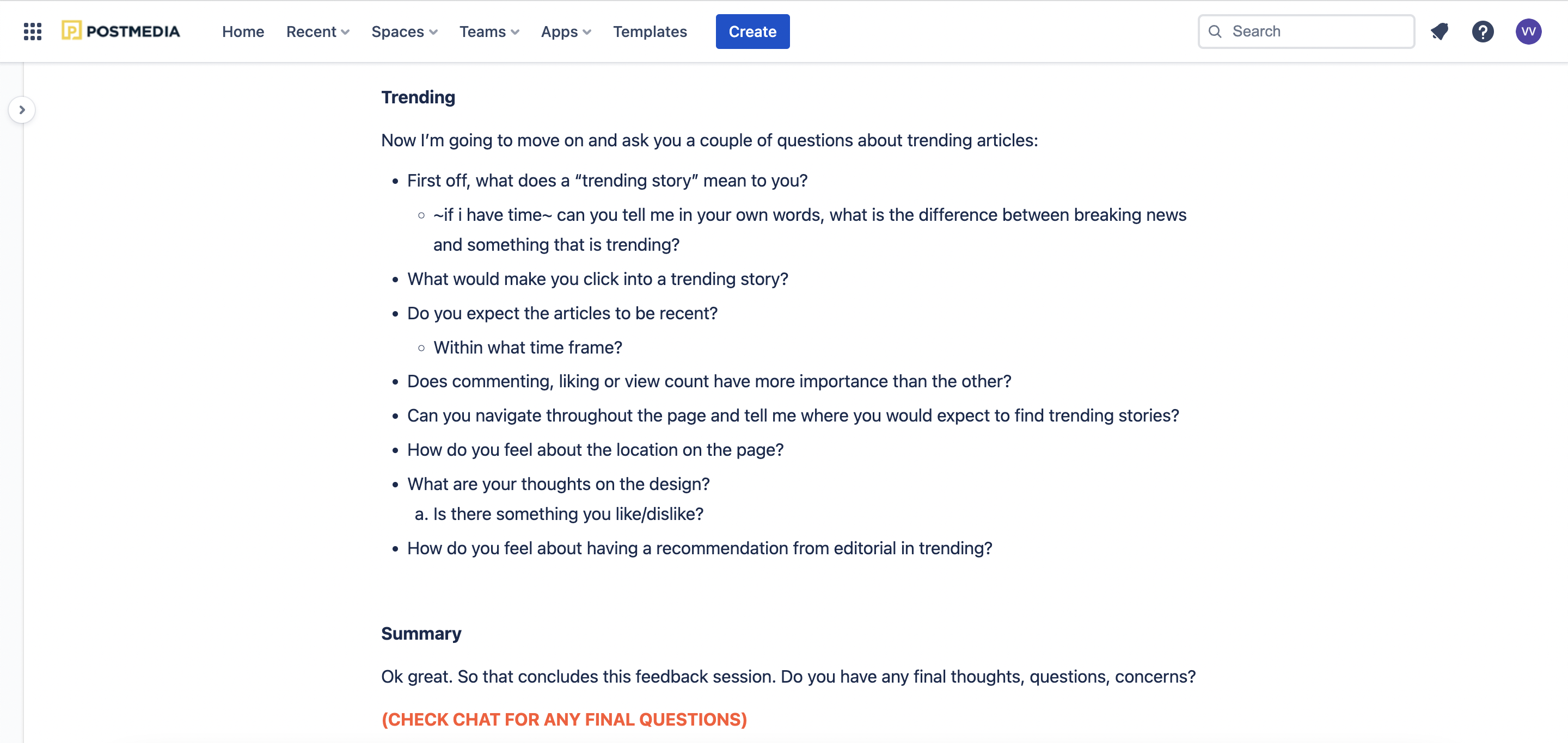
Trending:
- Move the trending widget to the top of the article. 4/5 users suggested that it should be further up on the page so it can be easily accessible
- Users expected trending articles to be recent (1-3 days) and “newsworthy” (high view count)
- While the amount of articles displayed in the widget were acceptable, user did not favor a “recommendation from editorial” within the widget (gave bias).

Ideate Phase
Google Team Recommendations
Postmedia recently had discussions with the Google team, who provided recommendations aimed at boosting engagement. Here are the suggested changes:
- Integrate a recirculation widget within our articles. This will encourage users to explore related content and enhance their overall engagement.
- Emphasize the use of images, as they have been proven to drive higher engagement. Consider ranking articles (e.g., using numbers like 1, 2, 3) to help users process information more efficiently. However, it's important to be mindful of limiting the number of articles to prevent decision fatigue.

Design Phase
Low- Fidelity + Mid-Fidelity
.png)

Hi-Fidelity
Desktop
Related Content
- By showcasing relevant related content mid-story, we encourage readers to explore more within the platform.

Desktop
Trending Homepage
- Added images
- Implemented in two positions on the page, at the top and under the second ad
- A strategic visual design using an orange highlight and fire emoji boosted user engagement with trending articles, making them appear more popular
.png)
Mobile Designs
Trending on top Story page
Trending bottom of page
Related Content


Results
Product/Design Highlights
- Added trending at the top placement as well as keeping the existing position for desktop and mobile
- The widget was added at the top on both category and article pages
- Adding trending icon (fire emoji) on the story cards
- The “Related stories” widget will have a different layout (blue coloured background) with the same backend logic
Technical Highlights
- The new config was added to each property that has the widget to include it in it’s second placement
- We excluded the new position from being added to the Homepage since the top stories are already displayed there
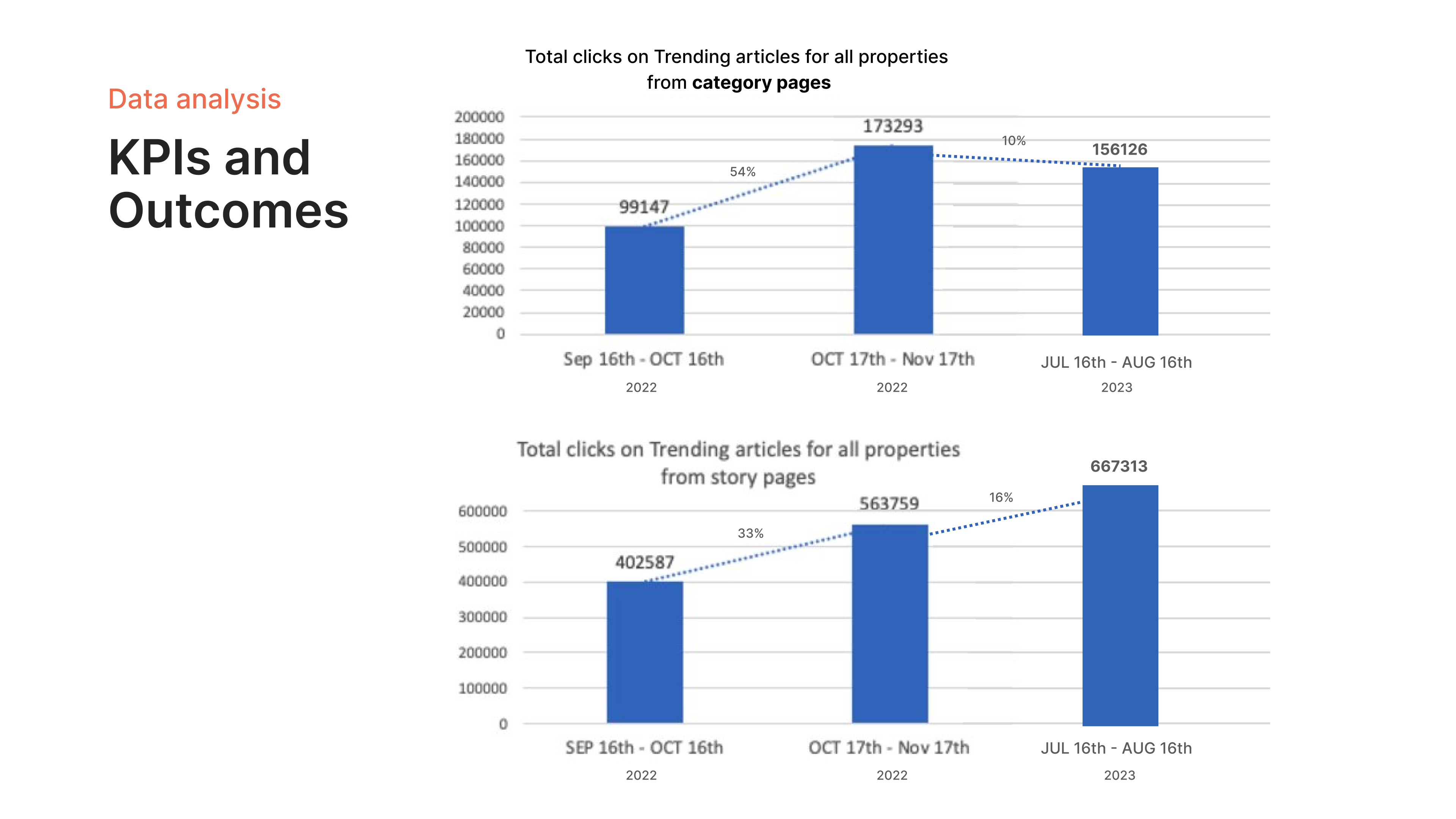
KPIs/Outcomes
This chart shows the total growth of clicks on trending articles from all Postmedia properties on category and story pages. From September to November a month after release there was a significant increase. 8 months later we can see trending on category page decreased however did not fall drastically. Fortunately, on Story pages the number kept increasing. This would be because of the trending top bar and right rail two touch points for users.
- Top bar gained the most engagement - increased our clicks
Takeaways
This project emphasized the importance of element positioning on a webpage. The location of a widget, in this case, a trending articles section, can significantly impact user interaction.
Initially, placing the widget too high on the page meant users scrolled past it before noticing it. We found that including both icons and text could better attract attention and highlight this section.
By letting users start by reading the article, and then presenting them with a "recommended articles" section lower on the page, we saw a significant increase in clicks on those recommendations. This suggests users are more engaged after consuming the initial content, making them more receptive to related suggestions.