


Project Overview
Currently when our users reach their maximum number of articles for the day or they are a non-subscriber user. They are presented with a modal that blocks all the content on the screen. Our solution will allow users to be able to see the article page without seeing the story, they will be able to scroll to the commenting widget to read opinions and view other components on the page such as Trending, Related Stories, etc.
Problem Statement
Users get blocked from viewing the story page and most of them bounce off since there are no other options to select from except for registering and subscribing. The current numbers show that the amount of users converting from that blocker is low.
Example of old blocker:
.png)
Solution
The new template for the locked article page will allow users to explore while blocking the key content. By representing the registration and subscription CTA in a more user friendly way, this can drive users to move further within the funnel and increase the conversion rate compared to the current baselines resulted from the fully blocked modal. There will be 3 different user cases and will need to be branded according to the publication.
.png)
Discover Phase
Competitive Analysis - Affinity Mapping - Red Route Analysis
.png)
.png)
Moderated User Interviews
We conducted a moderated user test to compare the effectiveness of an inline module versus a pop-up module.
.png)
.png)
.png)
Moderated Test Results
- There was a 50/50 split between inline and overlay. 2/4 preferred inline. 2/4 preferred overlay
- Note: There was also a split during the unmoderated test (56% for inline).
- 2 users preferred inline because it did not interrupt their reading experience and all the information was available in one spot.
- 2 users preferred the overlay because they get blocked right away and they know what's coming. Another user preferred overlay because “not everyone scrolls to the bottom”-Participant 2.
In sum there is no wrong choice, both options (inline and overlay) carry the same risk/reward.

Define
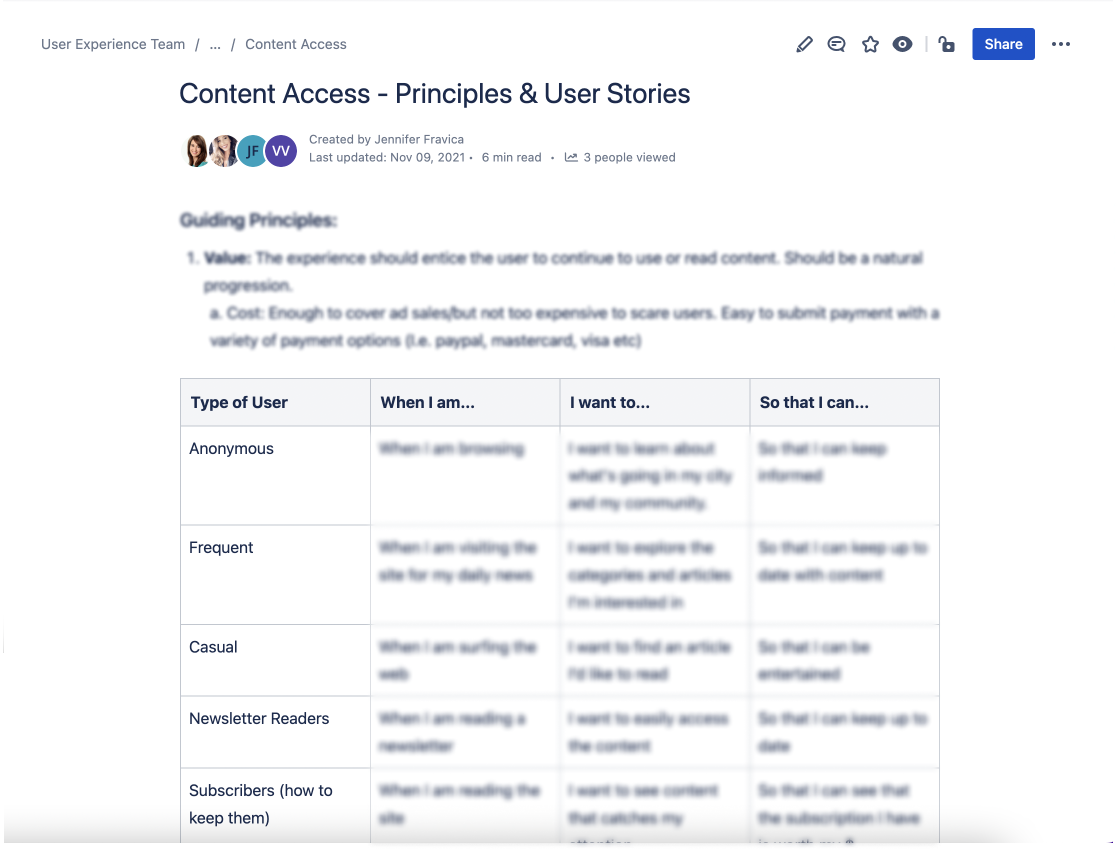
Principles & User Stories + Affinity map
The Guiding principles we focused on were: Value, Purpose, Inform, Clarity/Ease of Use, Spark Curiosity, Up to Date, Personalized and Layout

Ideation Phase
Created ecosystem to learn more about the domain, task flows to align design decisions with user's behaviour, and information architecture to understand the domain and IA which forms the basis for the app.
Hi-fi Flow
This user journey is to understand the purpose and direction for the experience as a whole. The main sections we focused on were Browsing, Awareness, Consideration/Conversion, Authentication, Consuming and Promotional.

For the next steps we mapped out how the users would interact with the paywall and which widgets we should consider offering for free. Widgets such as Trending, Commenting, Most commented, Read More and an article snippet.

Design Phase
Low-Fidelity + Mid-Fidelity Wireframes


High-Fidelity Wireframes
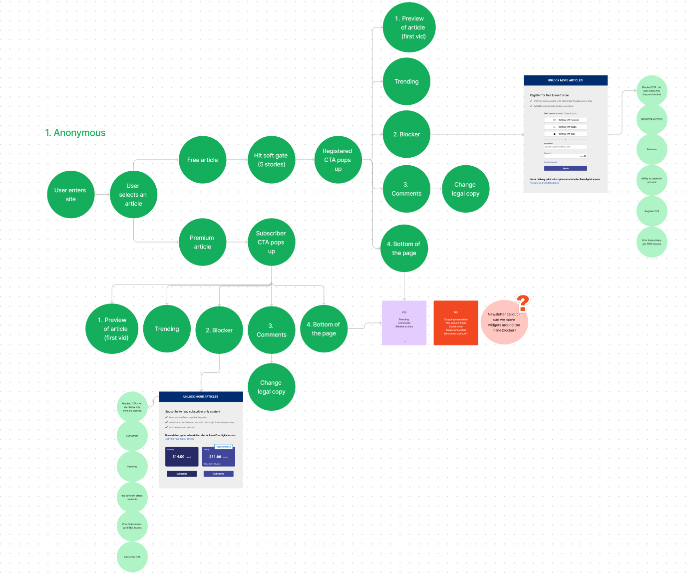
The blocker will change depending on which user type is viewing the screen.
Anonymous Users: without an account or not logged in to their account
- There is a new initiative I added to the scope of the project. Anonymous users are now able to make an account/sign in directly on the screen. By eliminating the need to navigate to a separate registration page, we reduce the number of steps a user needs to take to create an account. This leads to higher signup rates.
Registered Users: registered and can like posts but cannot post or comment
- The blocker shows a list of perks users will receive when they become a subscriber and we're able to show pricing or other offers
- We've included a message about if you already have a home delivery subscription you'll get access to online news for free. Some users are an aware of this feature so it is a good reminder.

- Subscriber Only Content - when the content can only be viewed by users who have a subscription

Enhanced the visual appeal of the comment section to draw attention and inform users that they can leave comments by subscribing.

Designing for all newspaper publications means adapting the brand for each instance. Always ensuring the correct colours and fonts will be used. With the help of the design system, this process can be very efficient.

Results
Product/Design Highlights
- Displaying locked article pages, while showing Ads and the widgets
- 3 different types of blockers (anon, registered and subscriber only)
- Commenting widget at the top with collapsible option
- Configurable text and offer pricing per property
- Fiction-less signing in experience directly on locked page
- New option for print subscribers to activate their accounts
Challenges/Risks
- Removing Trending from the right side
- Moving commenting at the top and the negative space issue
- Updating the Logo on the blockers
- Having different layouts for the taller pages
- Overcoming the Piano templates non-responsiveness
- Showing teaser of content above the blocker
KPIs/Outcomes
- Started tracking the premium content
- Started tracking the number of times each blocker showed up (PVs)
- WIP - Tracking the click events and conversions (Register & Subscribe)
- Increased Ad impressions for monetization
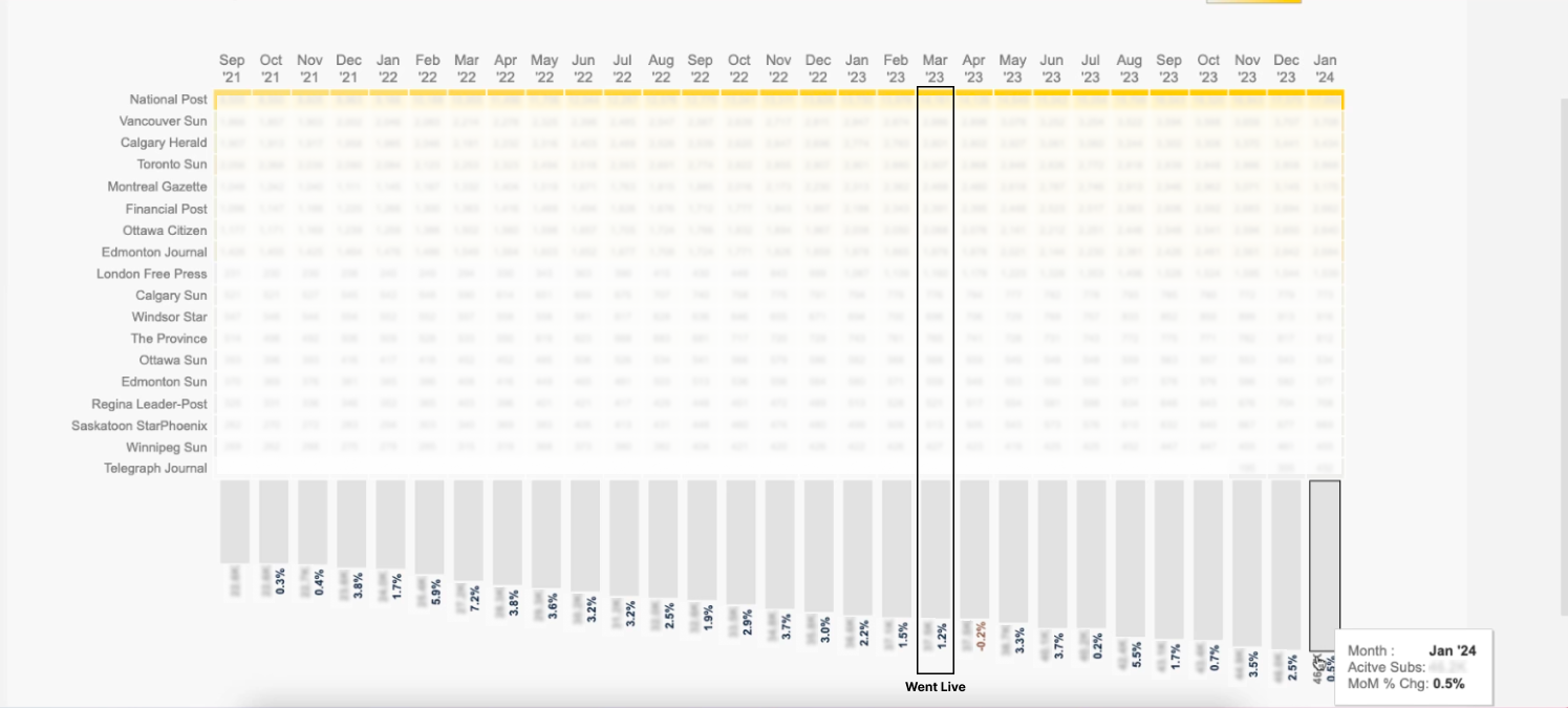
This chart shows the growth of subscriptions from March 2023 release date until Jan 2024. With the percentages showcasing the month over month change.
Takeaways
The project provided me with valuable insights into the design thinking framework, allowing me to deepen my understanding of the design process. Through this experience, I also enhanced my skills in creating visually appealing designs and prioritizing user experience by minimizing friction and making interactions as effortless as possible for users.