

Product Design/Research
Vivian V. (Product Designer + UX Researcher)
Stacked Products Evolution Redesigning and scaling the subscription add-on experience to help users easily discover, add, and manage a growing selection of products, local offerings, and newsletters.
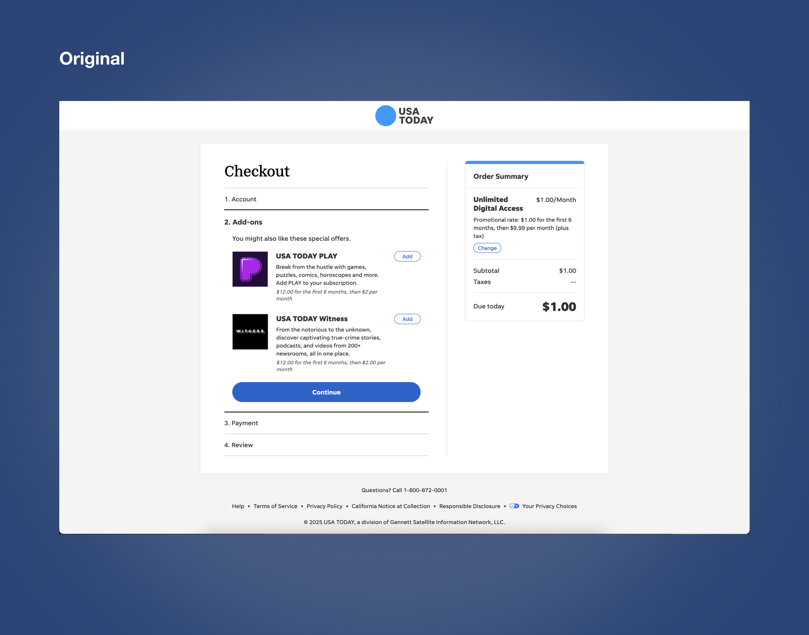
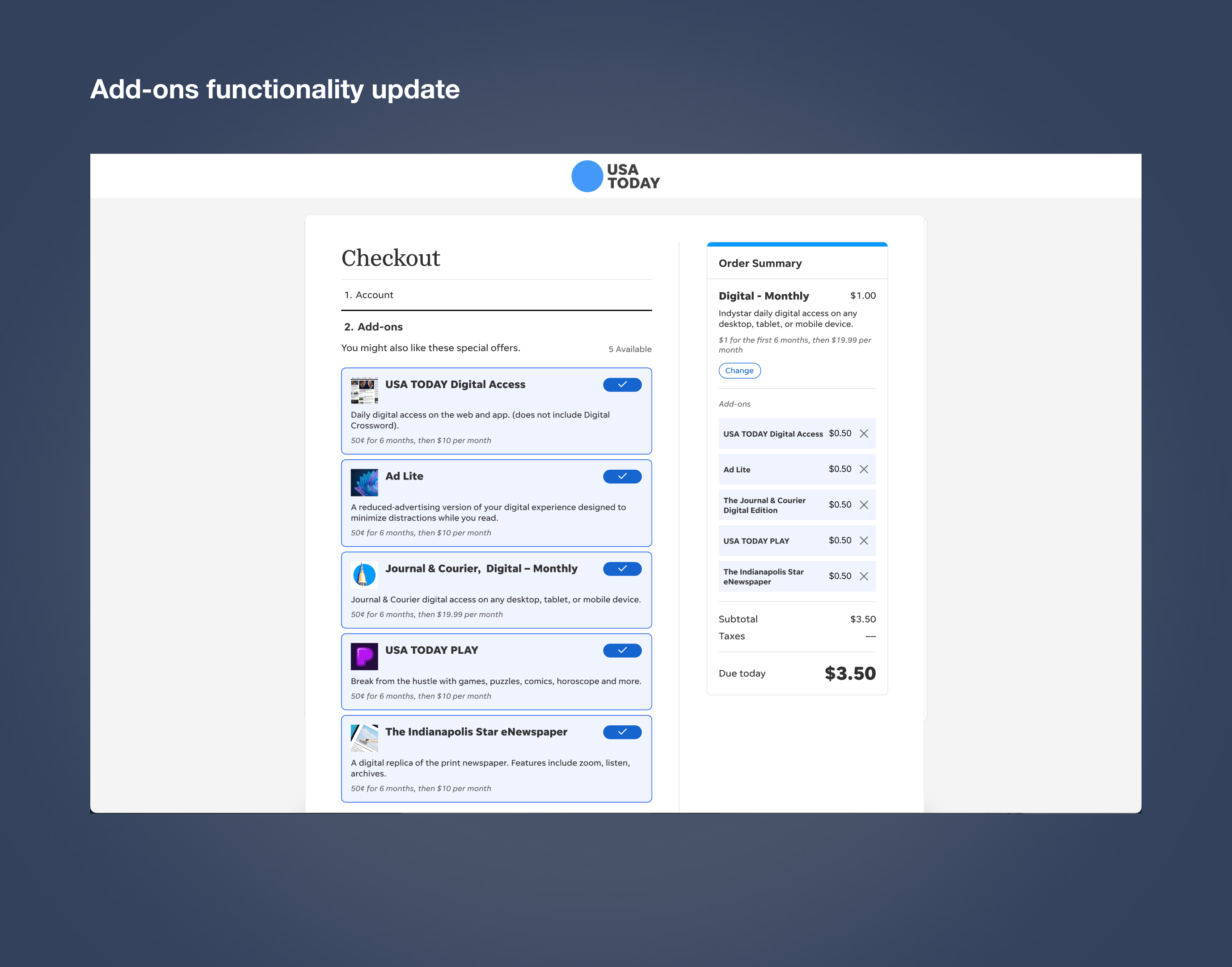
The subscription team was expanding its offering to allow subscribers to purchase additional products alongside their core subscription. My initial assignment was to design an experience that supported multiple add-ons within the subscription flow, while making it easy for users to understand, add, and remove products.
The goal was to create a flexible experience that could support the company's growing subscription offerings without adding unnecessary complexity to the purchase journey.
The existing experience needed to evolve to support more than a single add-on product.
As the number of available products increased, users needed a clear way to:
⭐️ The challenge was to design an experience that felt simple for users while also creating a foundation that could scale as more products were introduced.
Phase 2: The Evolution Introducing Stacking
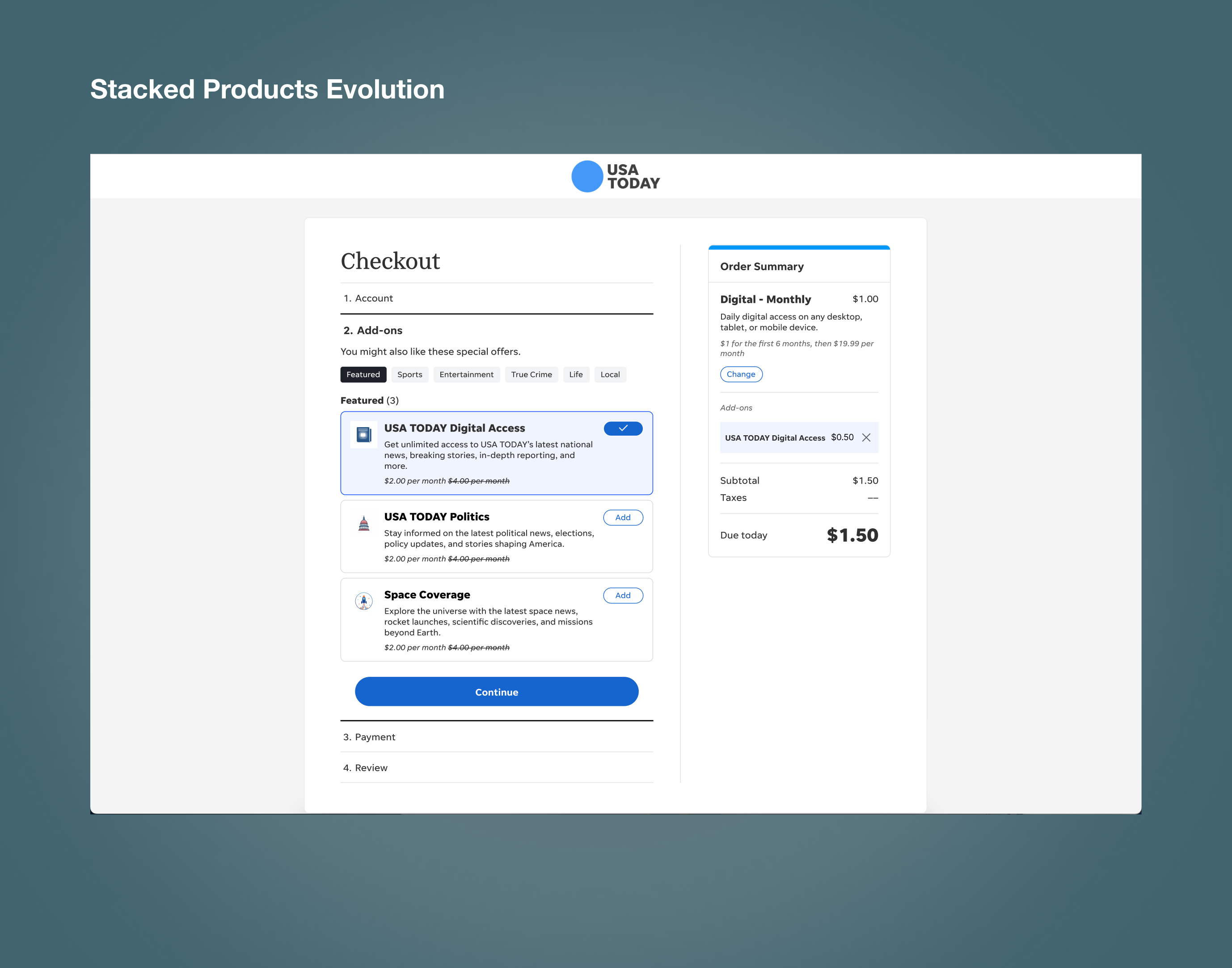
After the initial experience launched, the project evolved into what we referred to as Stacked Evolution.The next iteration significantly expanded the number of available add-ons and introduced local add-ons, creating an even broader selection of products for subscribers. As the product offering continued to grow, displaying every available add-on in a single experience could quickly become overwhelming. I needed to rethink how users would navigate and discover a much larger volume of products and newsletters.
Designing for Scale
One of the biggest learnings from this project was that shipping a solution doesn't mean the design problem is finished.The first release successfully solved the immediate need for managing multiple add-ons. As the business introduced more products and local offerings, the experience needed to evolve alongside it. The Stacked evolution allowed me to revisit the original solution and design for a new level of complexity. By introducing clearer navigation and organizational patterns, I created a foundation that could support an expanding ecosystem of subscription products.
How might we organize a growing number of add-ons without overwhelming the user?
I explored ways to create more structure within the experience while keeping navigation simple and familiar.
My solution was to introduce:
Looking at the original design, we identified several areas for improvement. One interaction that stood out was that when an add-on was selected, it moved to the "Order Summary" on the right and disappeared from the selection area on the left. With an increasing number of add-ons, this approach doesn't make efficient use of the available space and can make it harder for users to manage their selections.

Through competitive analysis and research into ad-lite products, I identified industry patterns for bundled products and discount structures, helping inform the direction of the subscription experience.


Starting with the live user journey, I worked closely with the development and product teams to clarify scope and constraints. I asked targeted questions to understand what we could reuse, change, or build on, and where we had flexibility to explore new design solutions.

Phase 2 Stacked Evolution: Organizing the list of add ons
We were given a list of add-ons and tags from the Consumer and Editorial teams. Since I was evolving the experience into a tab-based structure, I created new section and dropdown names to better organize the products and make them easier to navigate.

These designs were created to test different layouts during user research, ranging from mid-fi to hi-fi for greater accuracy. I explored different branding, organization, and layouts to understand what resonated best with USA TODAY readers.


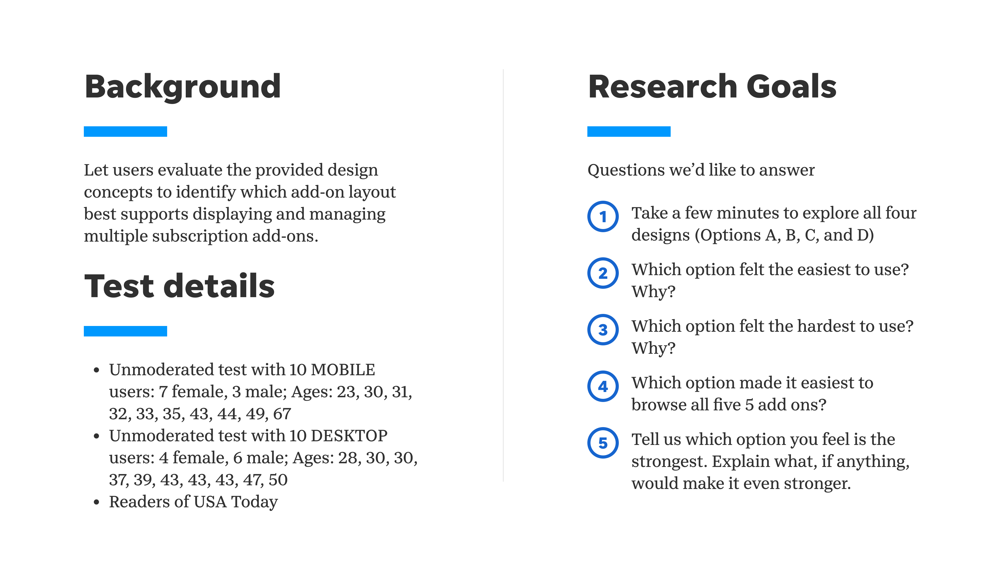
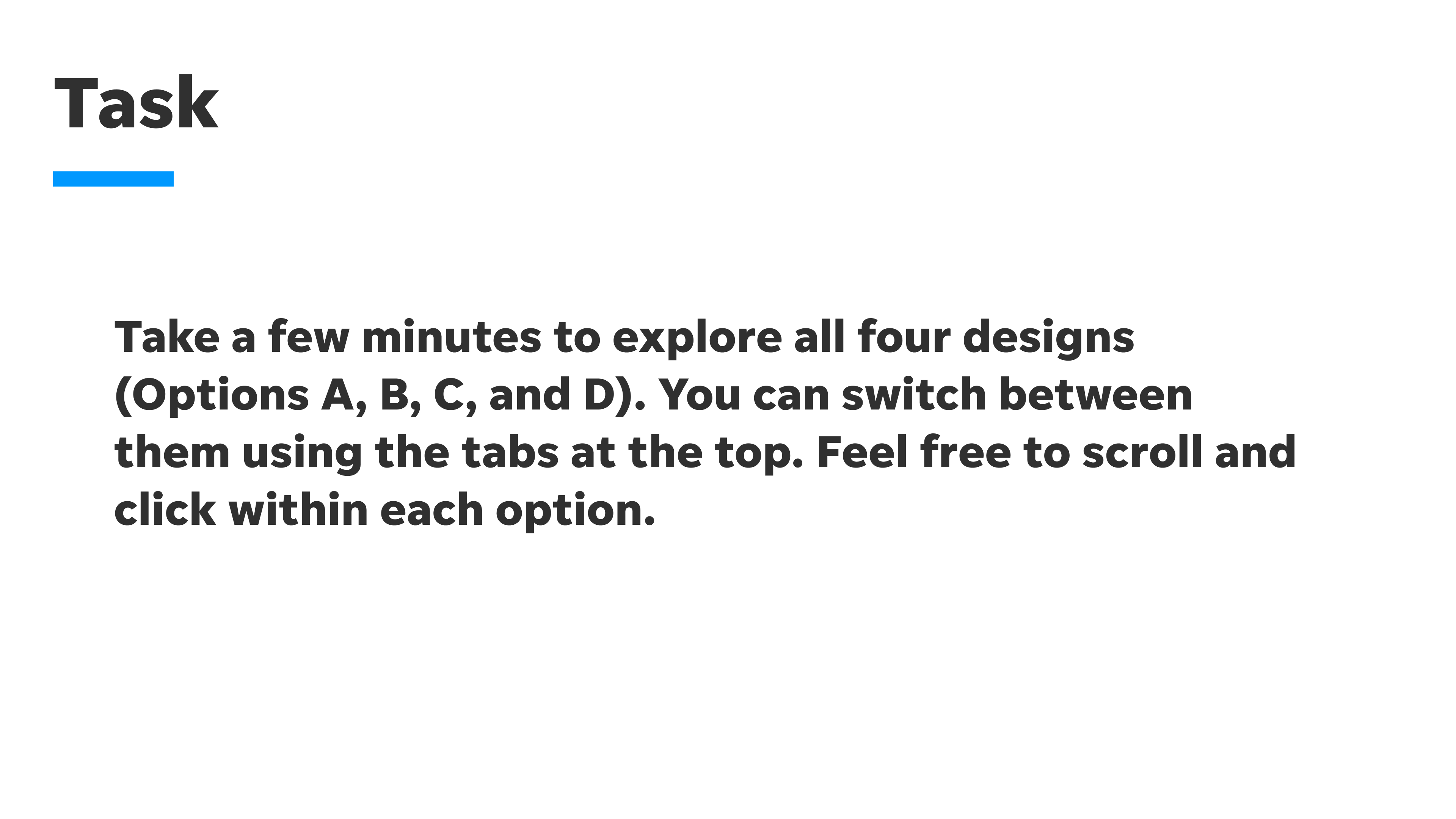
I start by developing a test plan and screener to identify participants who fit the target criteria. I then conduct usability testing through UserTesting.com, combining structured tasks with open-ended questions to understand both user behaviour and the reasoning behind it.After testing, I synthesize the findings using charts, spreadsheets, and Excel data, bringing together both quantitative and qualitative insights. This includes metrics such as task success, rankings, preferences, and ratings, alongside qualitative feedback, observations, and recurring themes from participants.


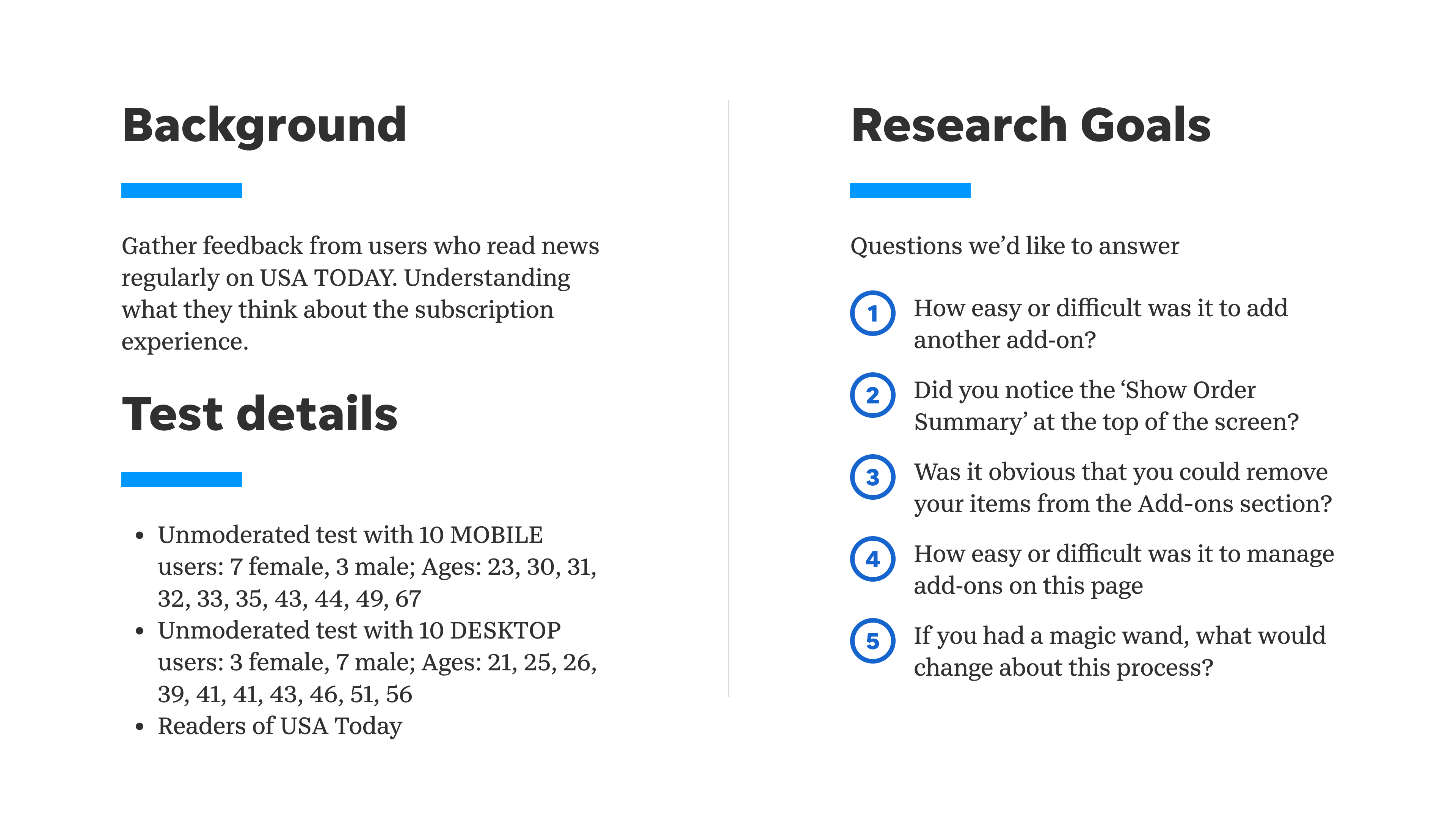
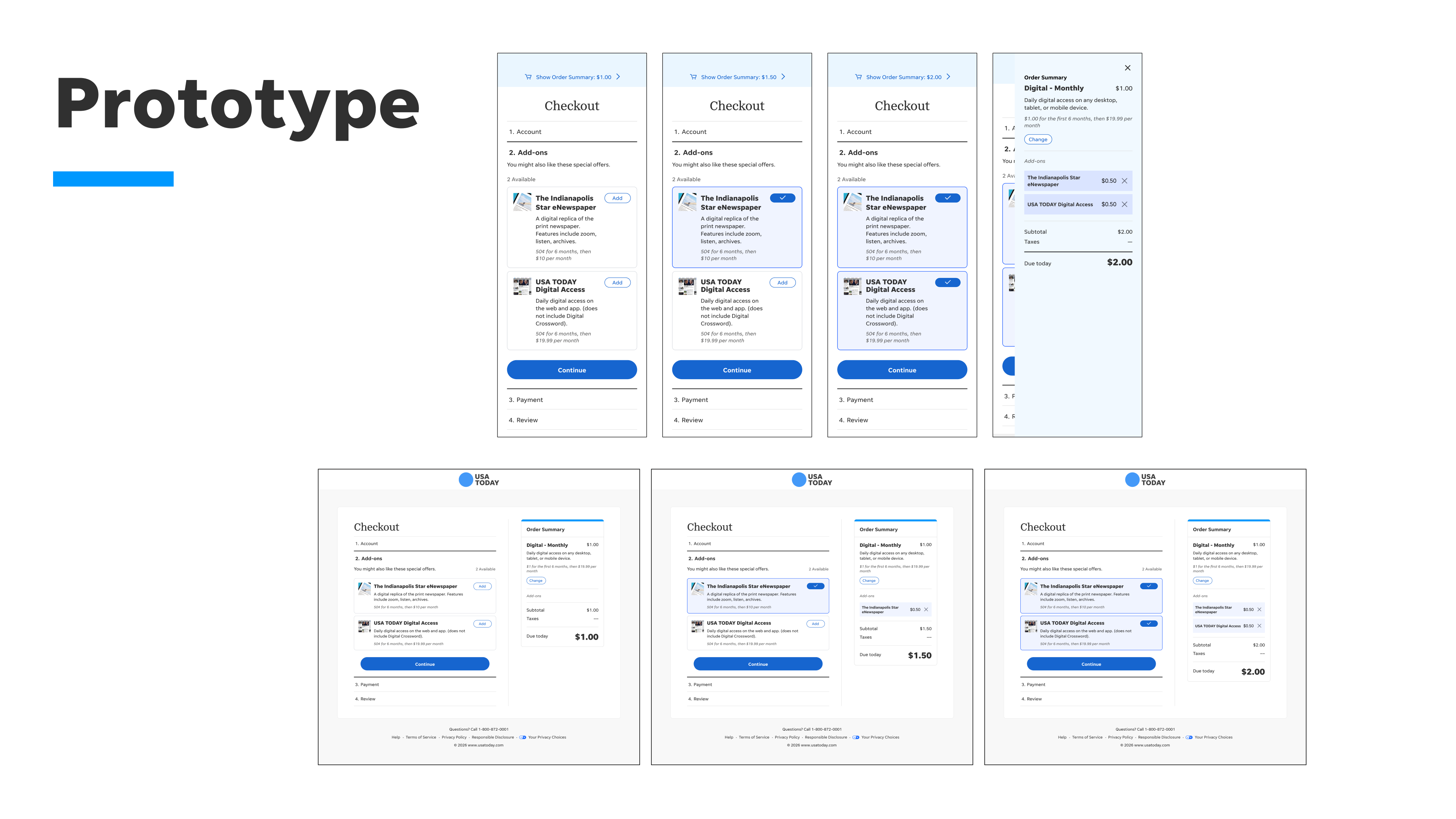


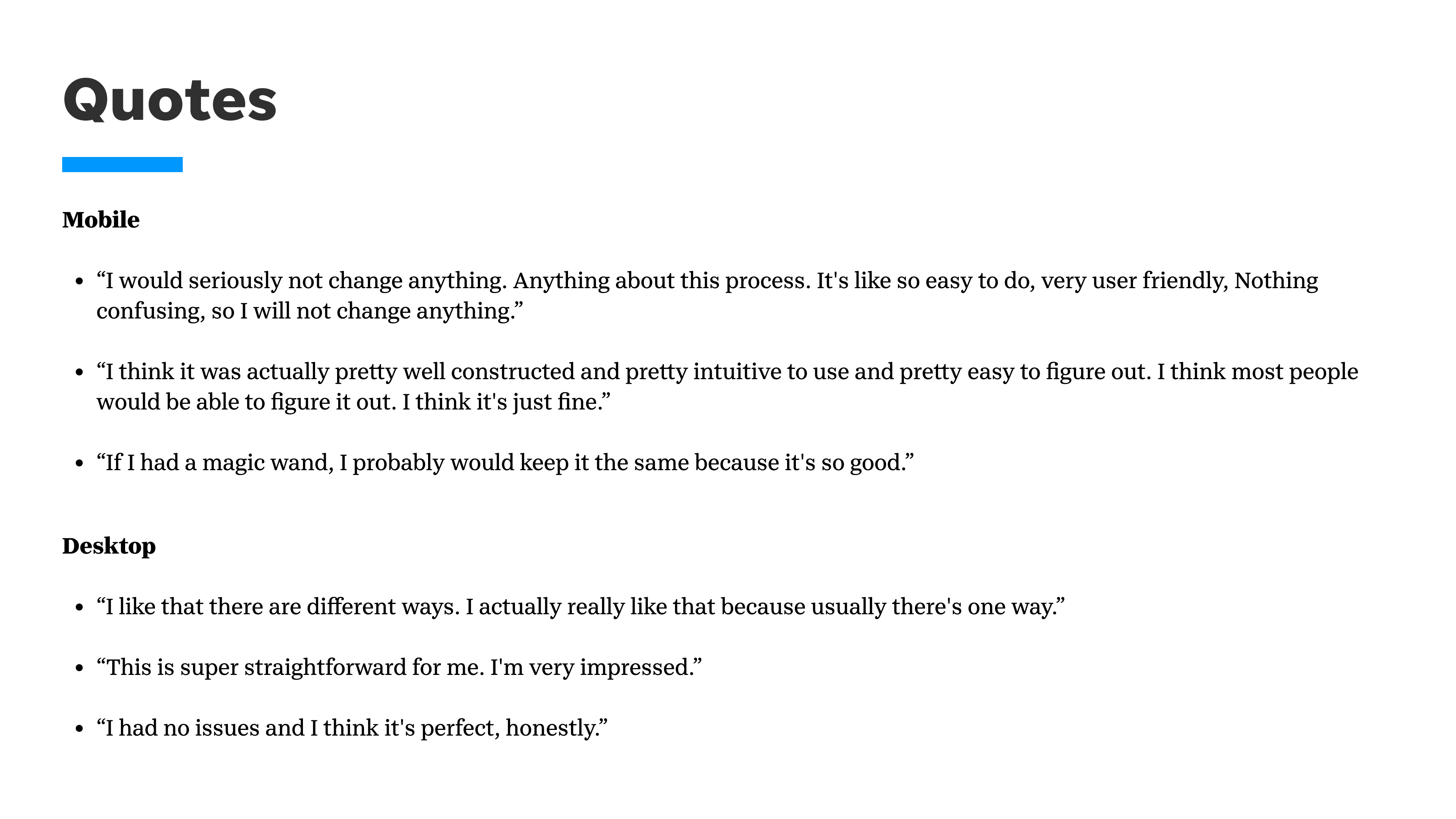
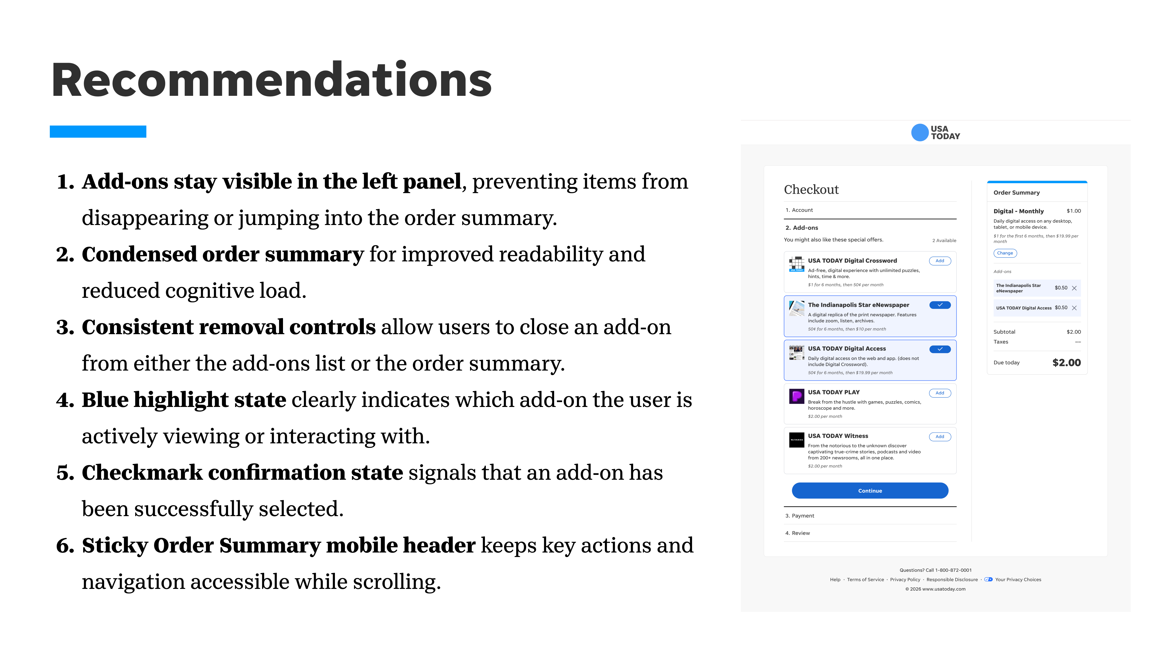
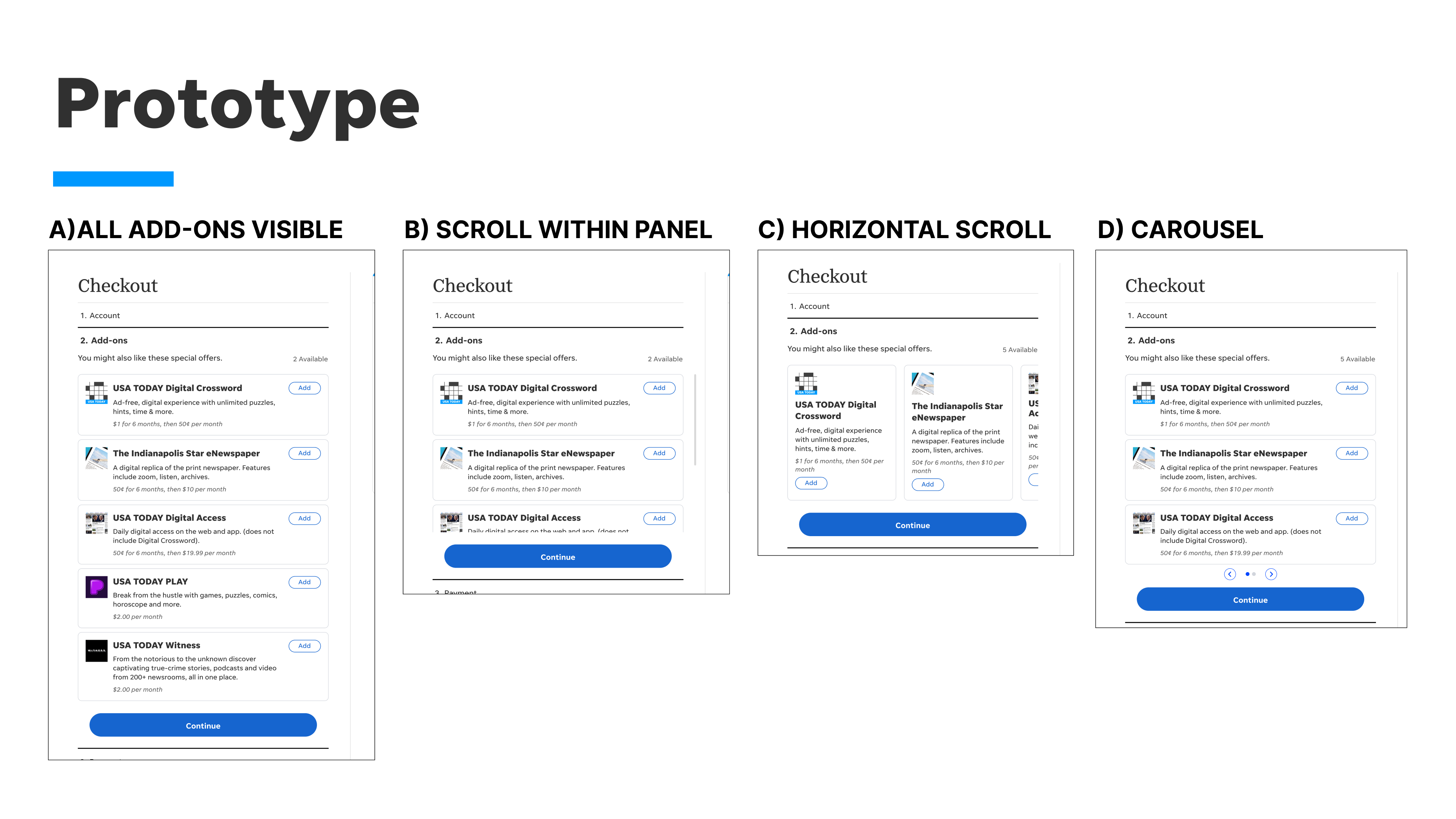


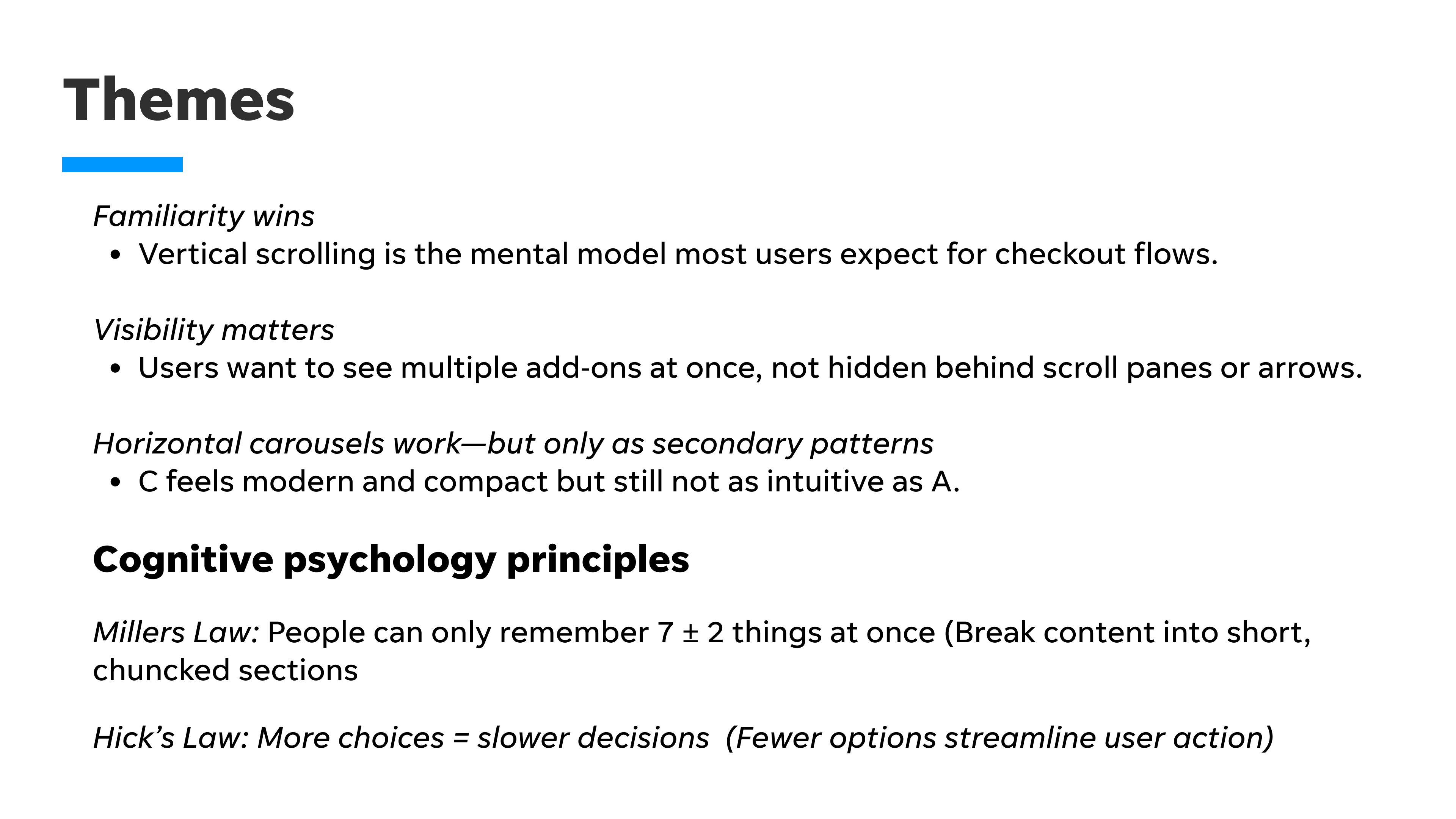
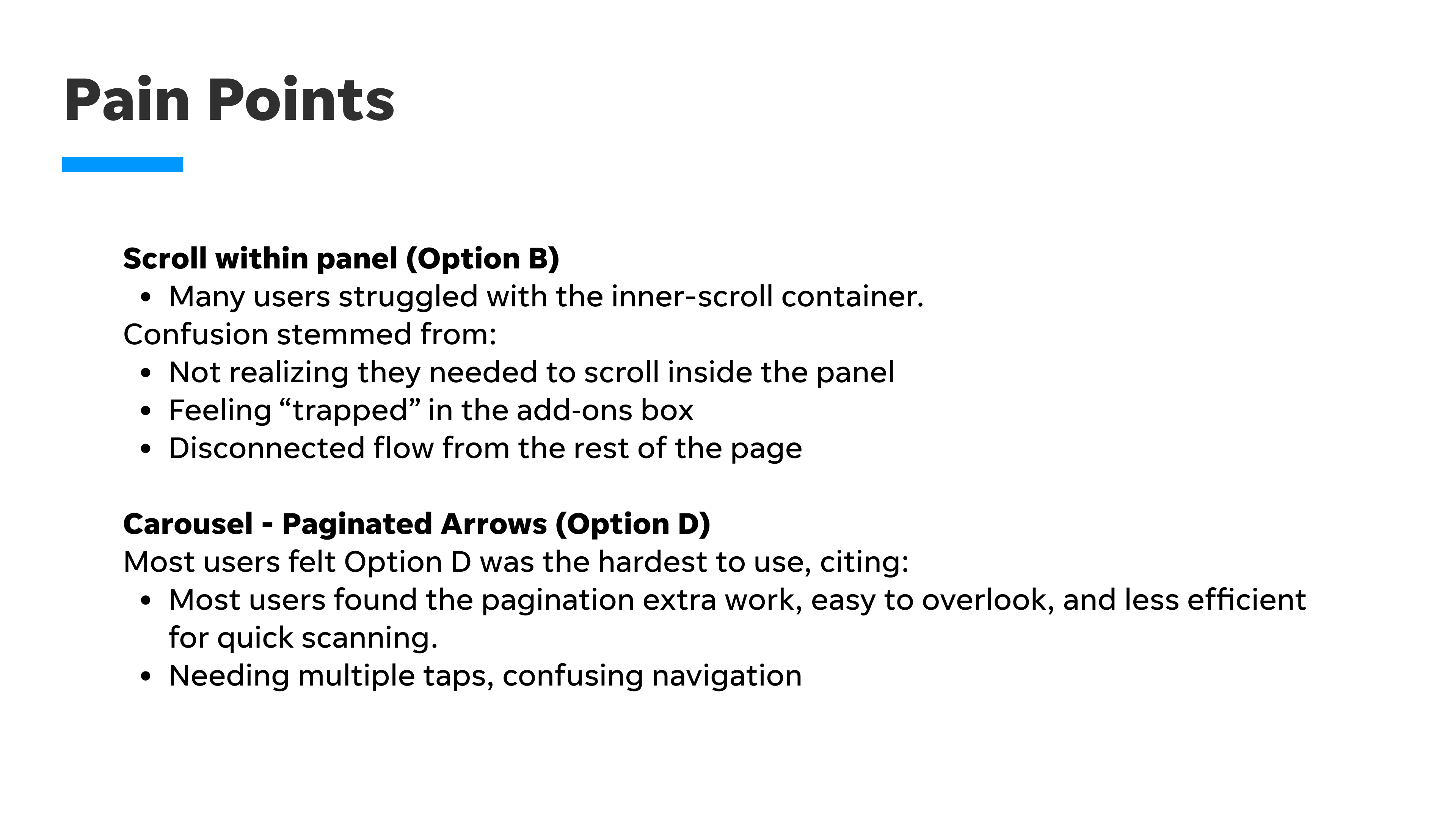
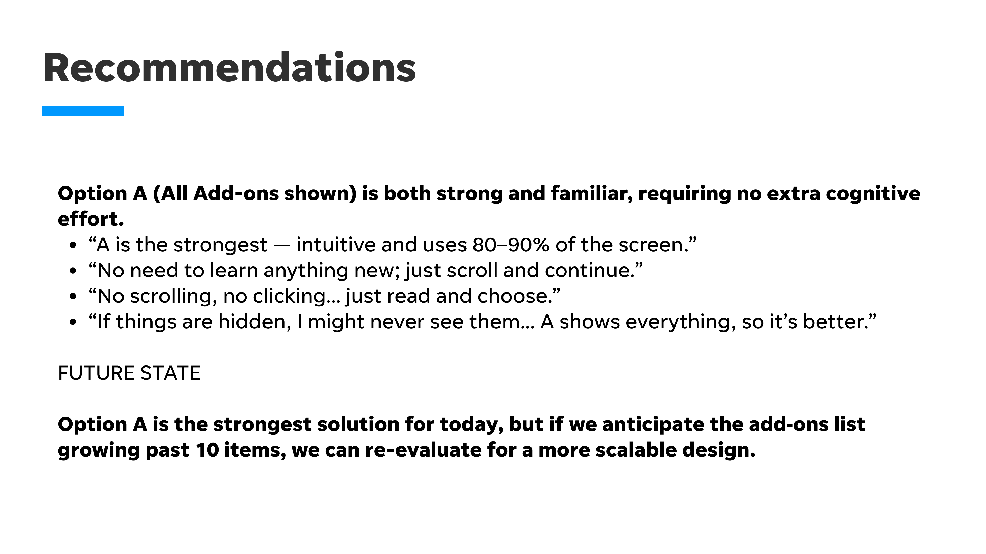
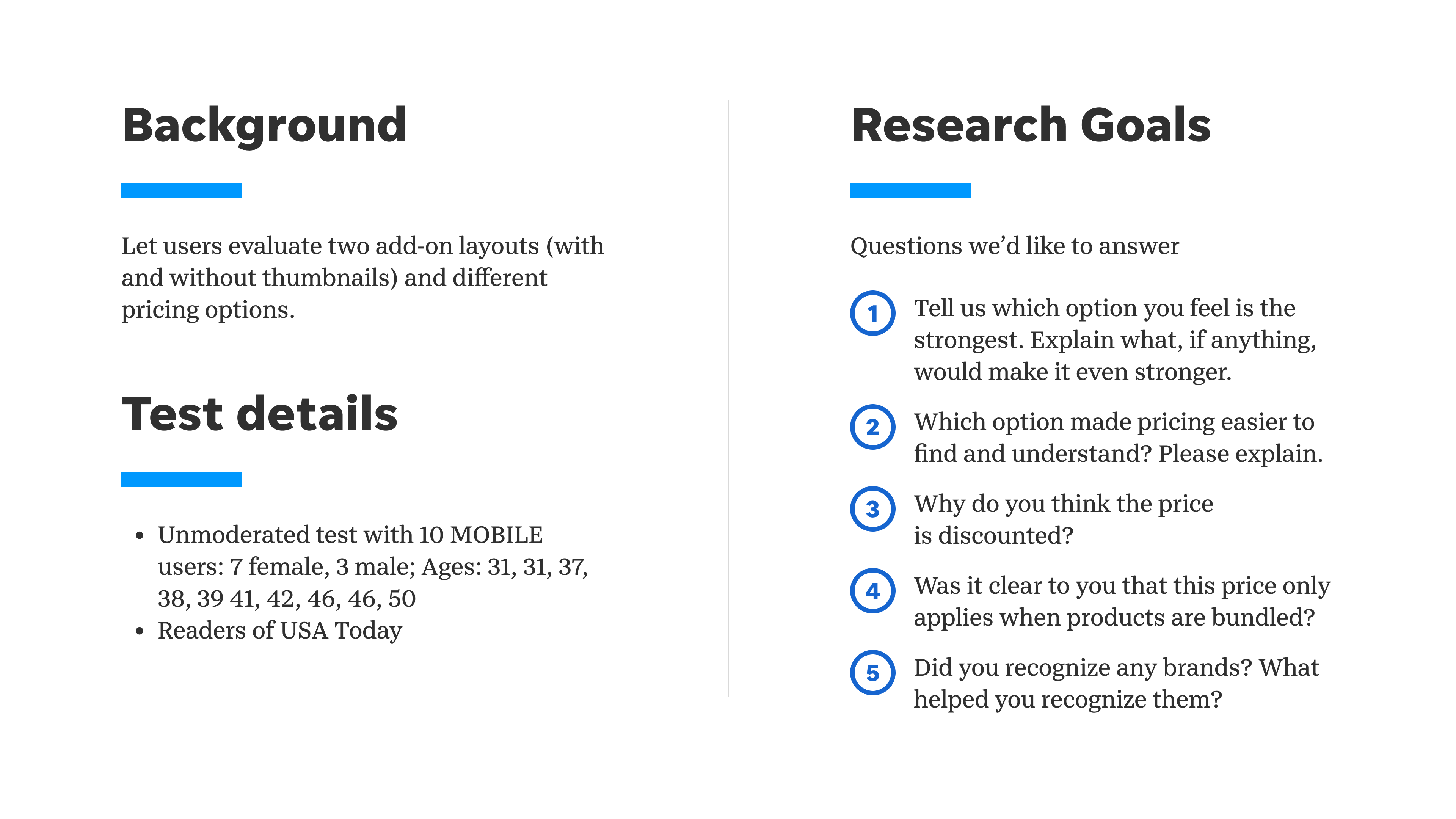
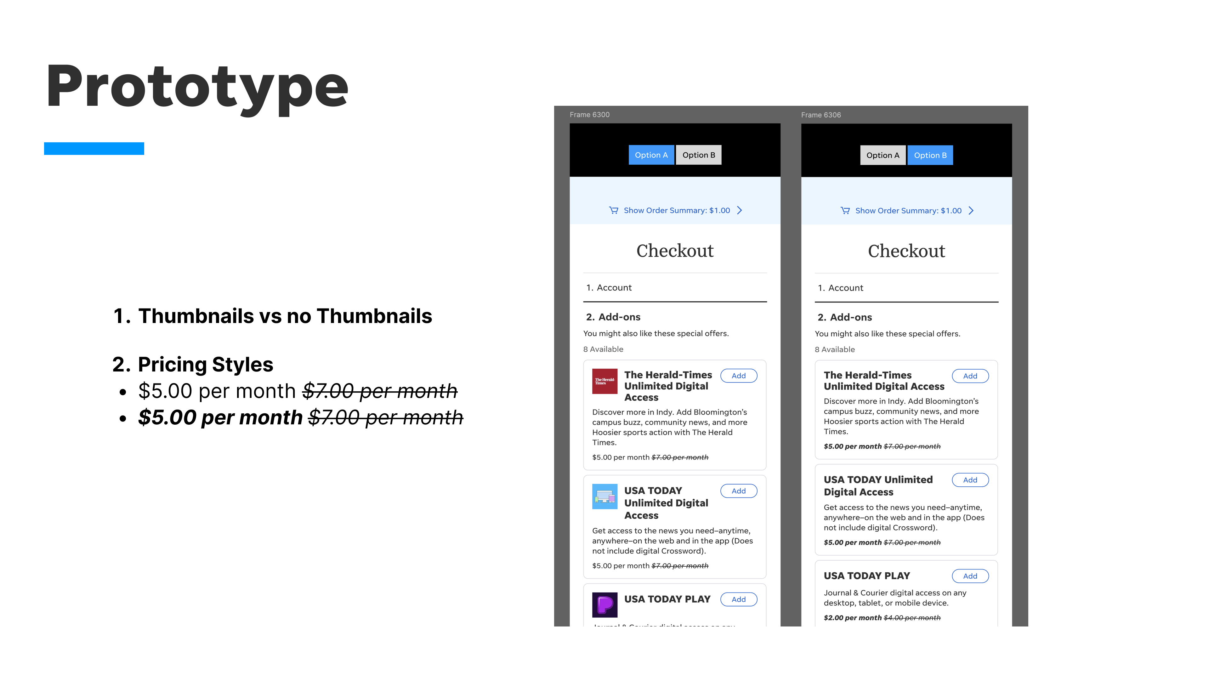


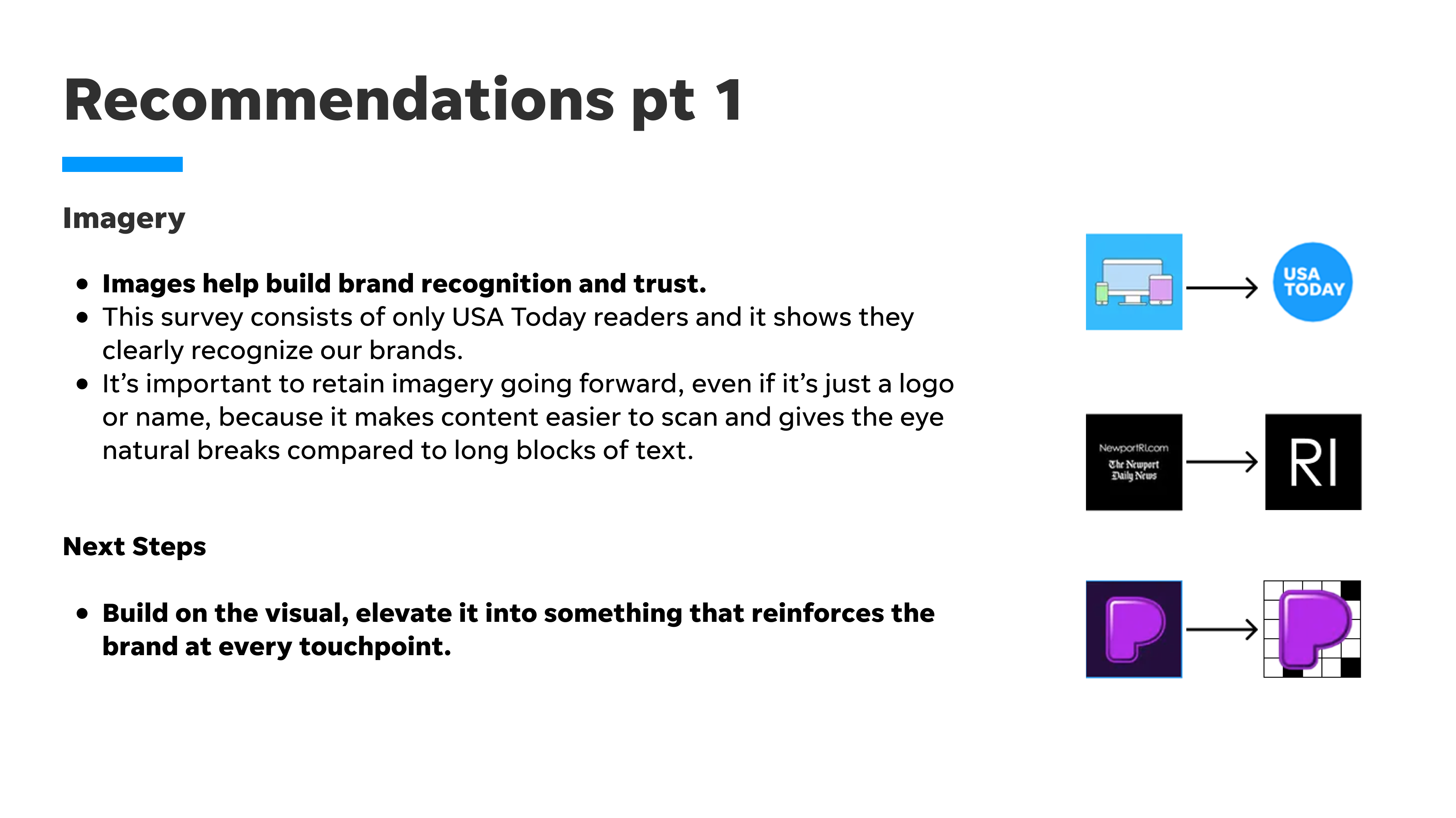
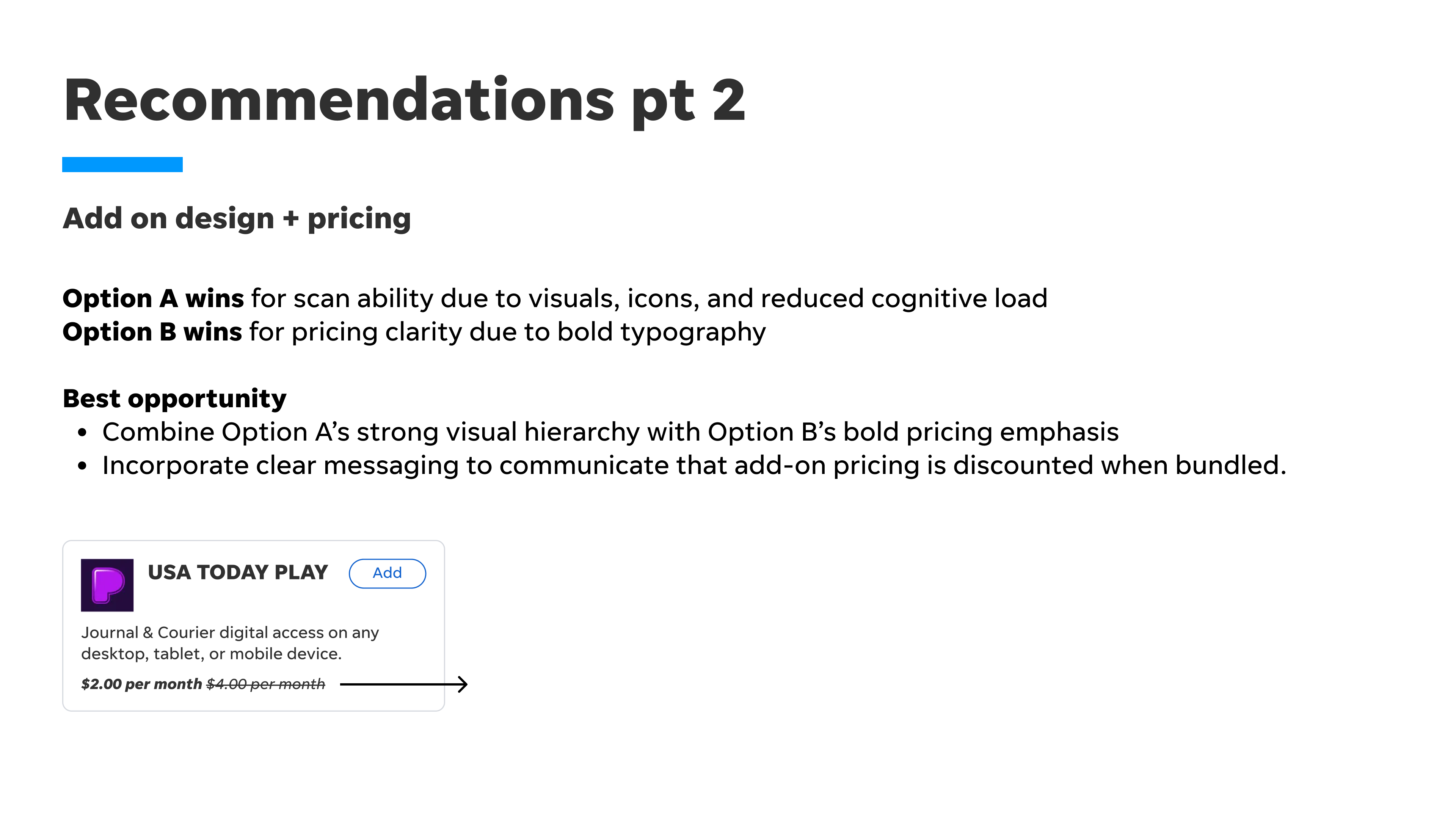
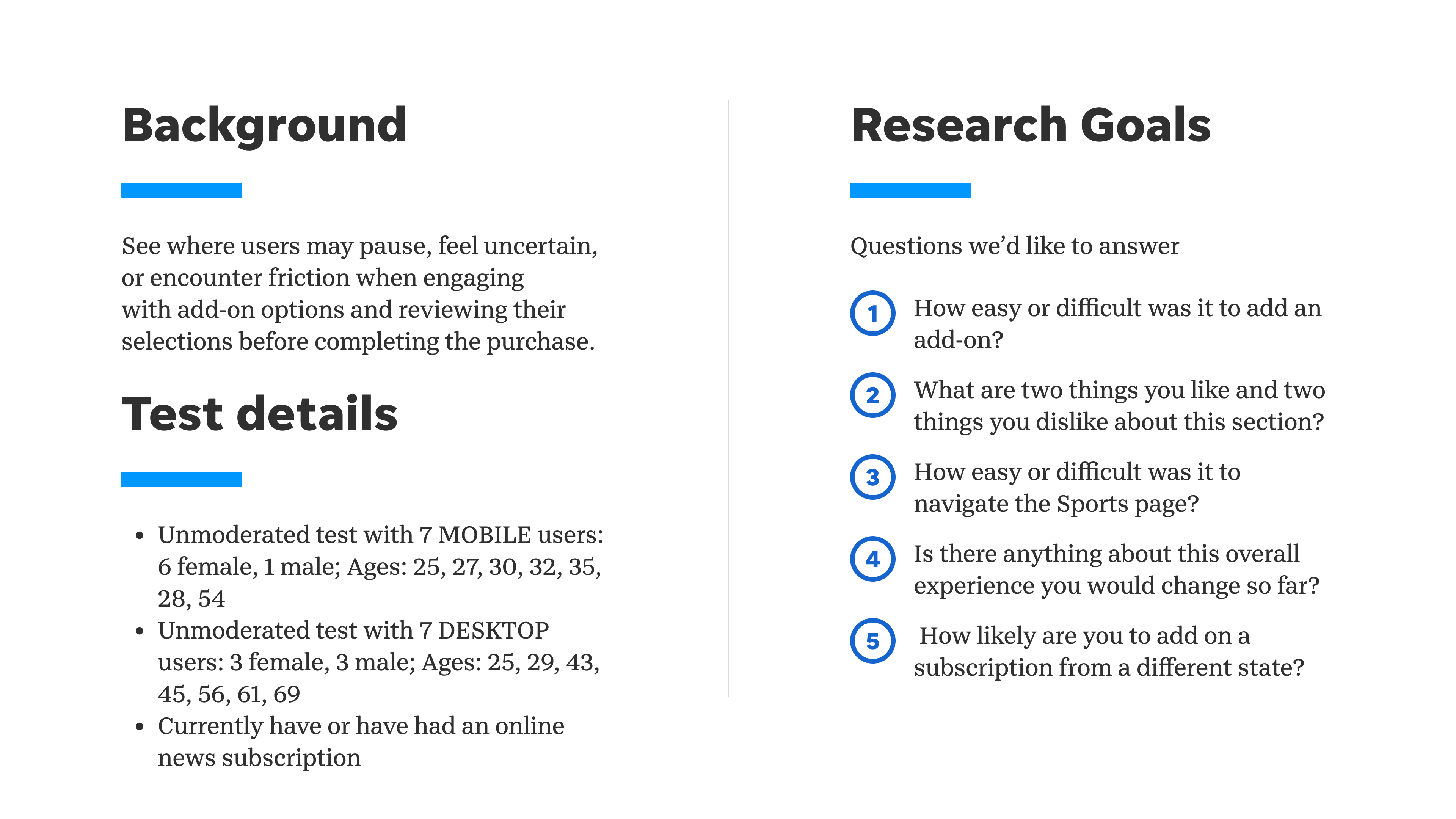
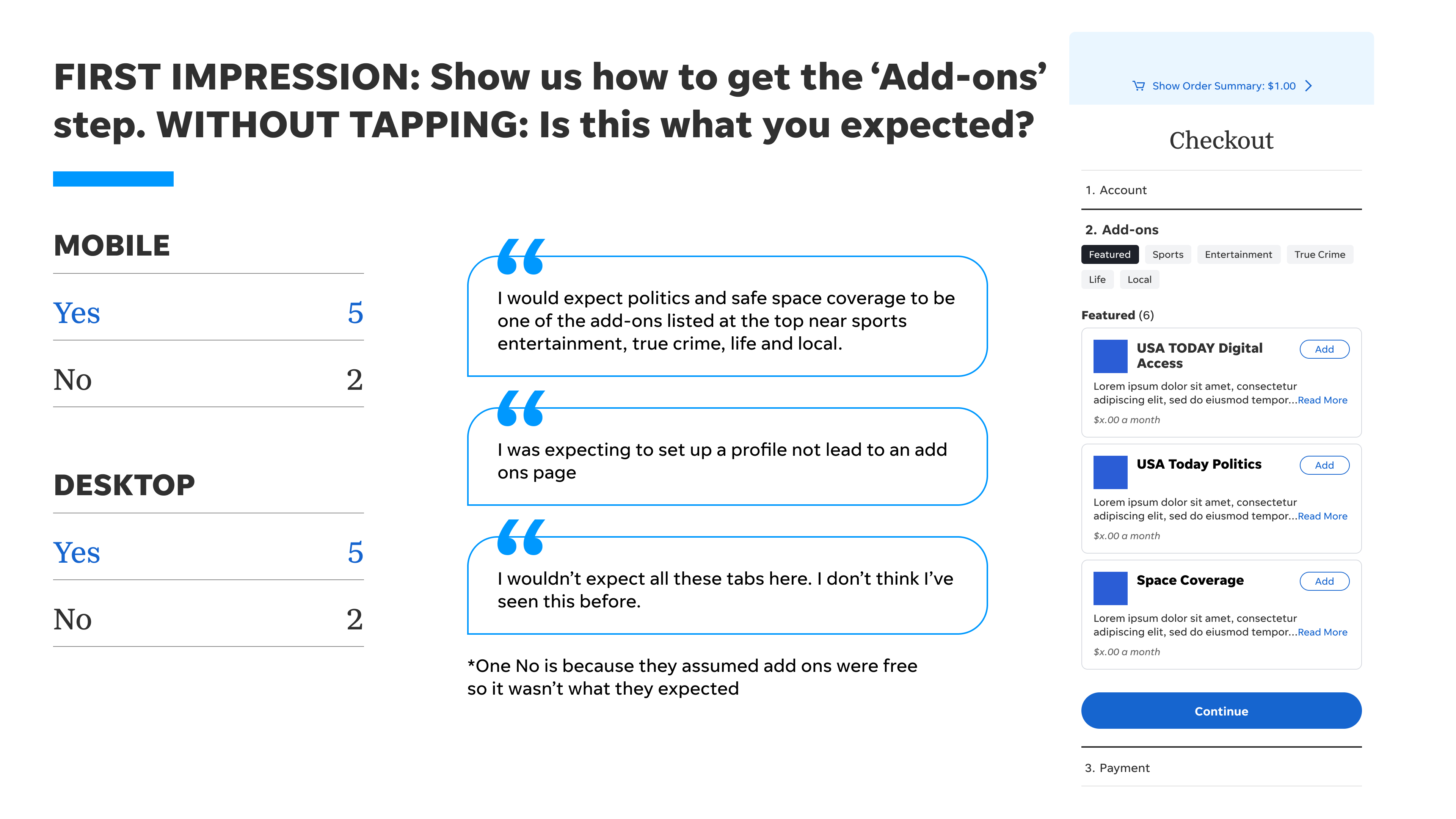
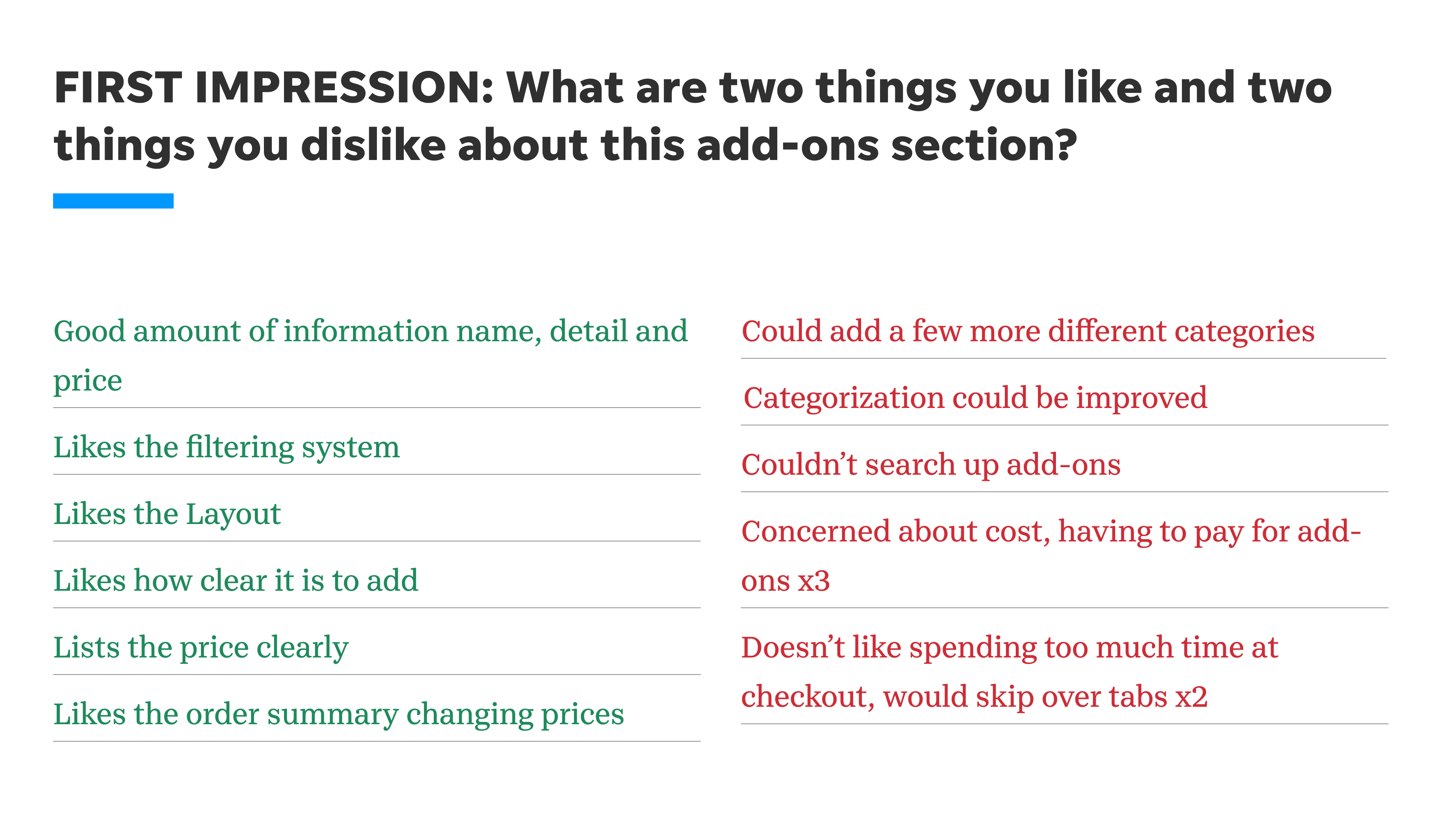


After collaborating with cross-functional teams, we developed several promising directions. I brought my vision into the designs, and the next step was to put these ideas to the test and validate them with users.
These are the live screens. Next, I’ll walk through the design process and the changes that shaped the new experience.


I’m really happy with the outcome of this project and excited to see where it goes next. The final direction was grounded in extensive qualitative and quantitative research, which helped validate decisions and shape the overall experience.
This project reminded me how much I enjoy exploring, asking questions, and turning research into meaningful design decisions. I learned that strong collaboration and being open to iteration can push a design further than the initial idea. Most importantly, it reinforced that shipping a design isn’t the finish line but it’s an opportunity to learn, improve, and keep creating a better experience!