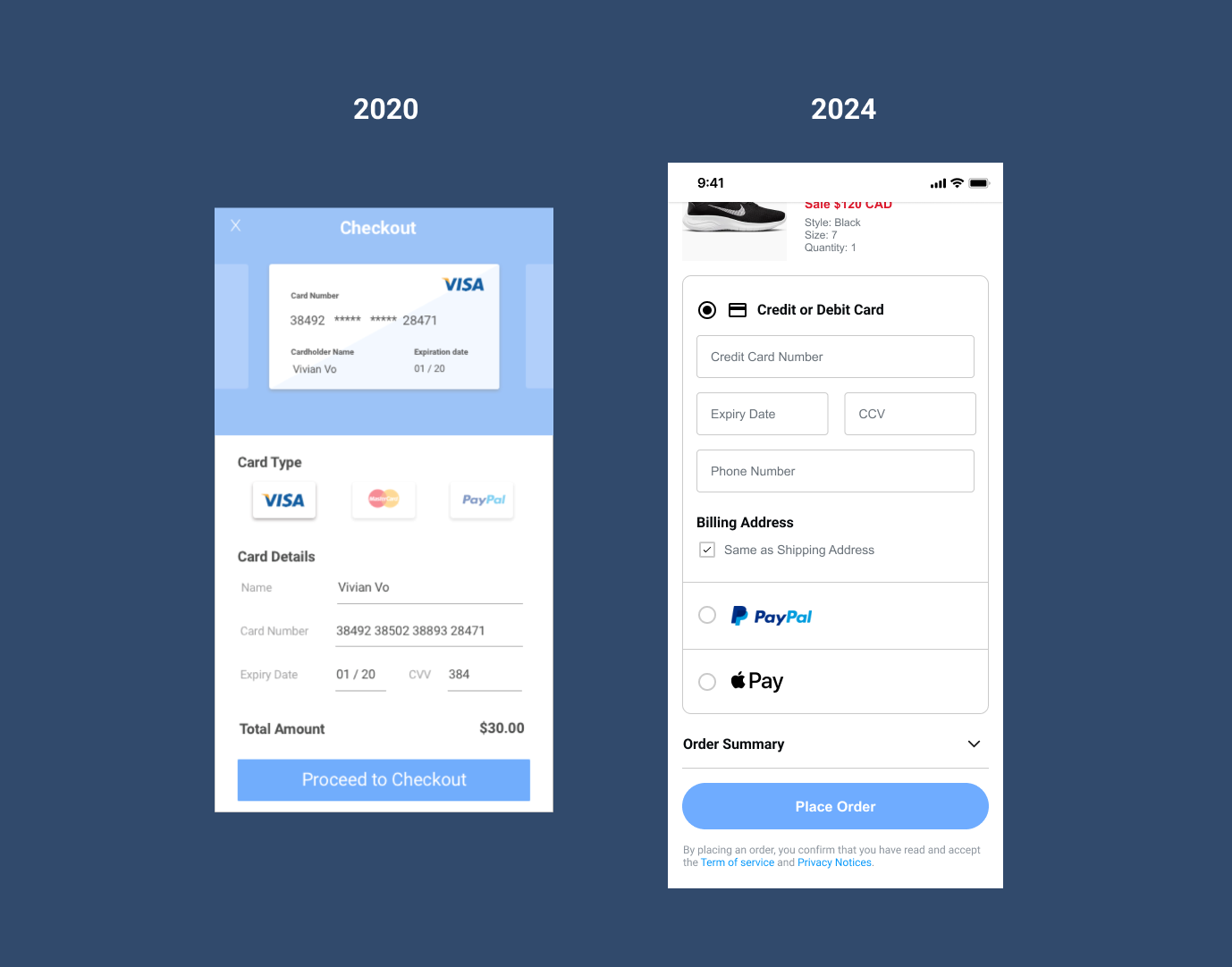

I have revamped the checkout experience, introducing modernized form fields to simplify the information input process.
I have incorporated additional details and options into the signup procedure while maintaining the existing branding and introducing innovative features.


I've addressed the impractical size of the navigation bar. The log-in and profile icon should not appear at the same time, and the hamburger menu has been relocated to a more intuitive position. The new changes aim to offer users quicker access to information.
I made minor adjustments to this design, fixing button spacing and ensuring proper screen fit. The background colour was changed to enhance button contrast.

Implemented a paper-like effect on the icon and organized the colour scheme and layout to look more structured.
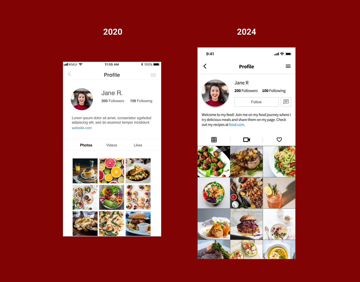
Incorporated essential Call to Action buttons like "follow" and "message." Reduced white space to bring images into sharper focus.
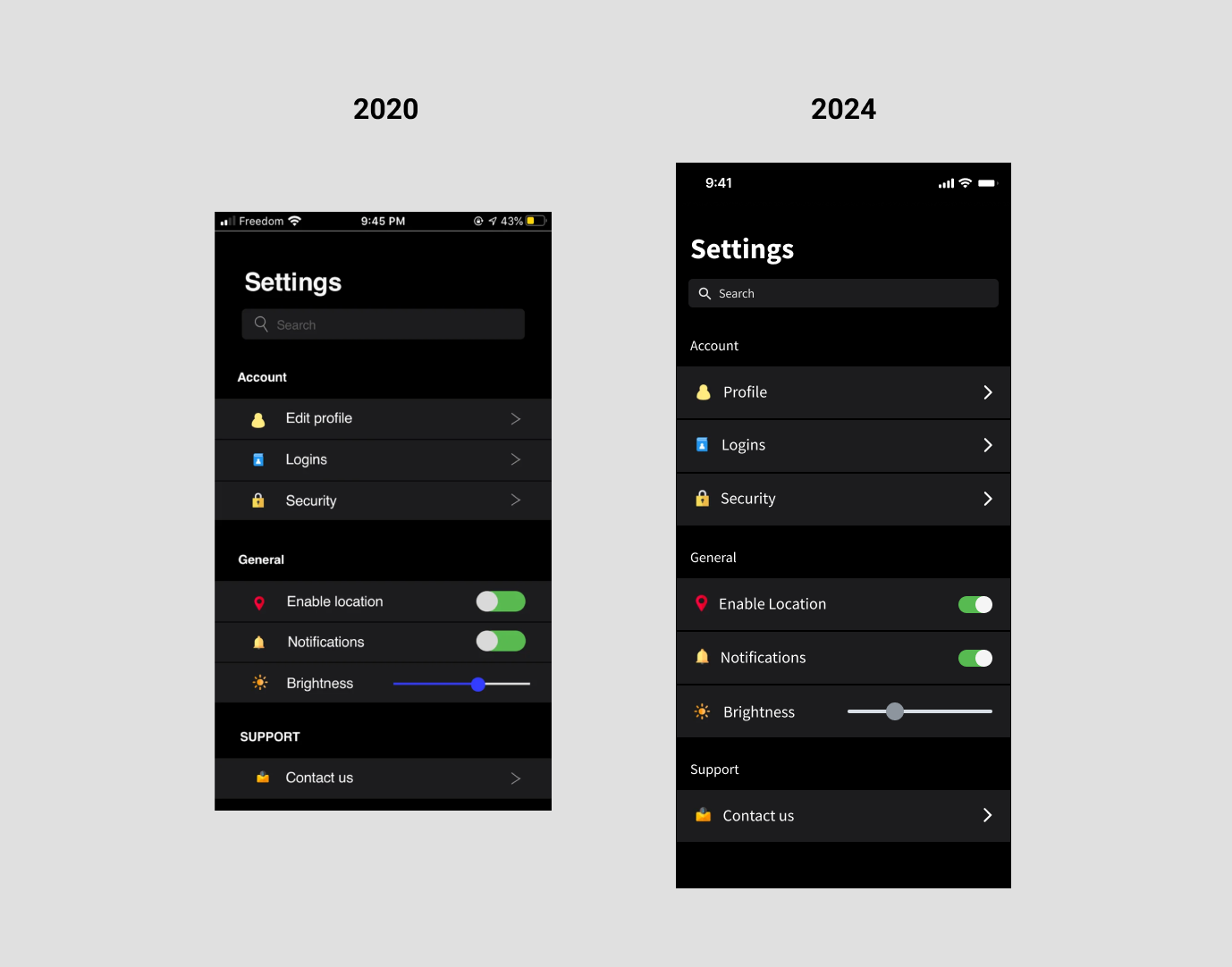
I corrected the orientation of toggles, ensuring they are flipped correctly. I redesigned the arrow icons for improved aesthetics and implemented consistent spacing between categories.
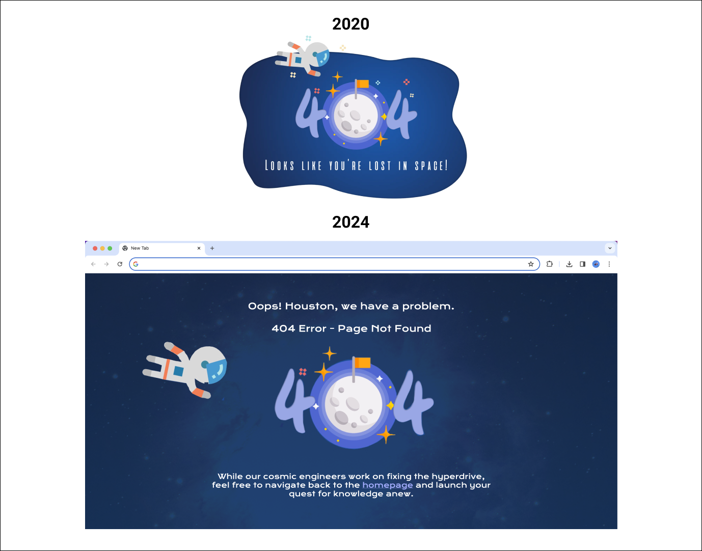
The initial design appeared too simplistic for a desktop error page. In the updated version, I've introduced copy that aligns with the theme and included a link to redirect users back to the homepage.

Maintained the existing design while expanding the touch target on the buttons for improved usability.
I originally designed it inspired by a clothing store, but since they've undergone a rebranding, I've made adjustments to align with their new brand identity.